


Vermilion
THE COLOUR OF VALUE
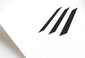
Vermilion, a Calgary-based oil and gas company, approached Letterbox with a corporate identity that had outlived its relevance as the company grew. They challenged us to update their image to better reflect their positive corporate philosophy and leadership position in their industry. The resulting logo vibrates with visual energy from 5 horizontal lines, each floating freely and shorter than the one above, connecting cerebrally to form a V. The vermilion colour reinforces the Company's name, creative approach and its industry — oil and gas.
The new positioning line "The Colour of Value", a play on their vibrant name, reinforces Vermilion's position as a value leader in their industry. This was the start of our ongoing relationship with Vermilion, which has grown to include various corporate communications and a yearly annual report over the course of the last 7+ years.